Wednesday, November 25, 2009

Propaganda: Beautiful People

In this ad for women's shoes in the 1930's, they use a close-up of a beautiful women's face, depicting happiness. The company also uses "Young America" in their slogan to insinuate that the buyer will look young and stylish if they make a purchase.


In this shoe advertisement campaign for the 'Air Jordan' started in the 80's, the slogan "Is it the shoes?" is being used. The motive behind asking this question is to make the consumer think that the shoes make Michael Jordan perform like he does on the court. This throws out the idea to the consumer that he/she might be able to increase their athletic status.


Wednesday, October 28, 2009

Artist: Lucian Bernhard
Movement: Sachplakat
Artist: Lucian Bernhard
Movement: Sachplakat
Artist: Lucian Bernhard
Movement: Sachplakat

Sunday, October 25, 2009

Artist: John Van Hamersveld
Year: 2008

Artist: Victor Moscoso
Year: 1966
Artist: Alton Kelley
Year: 1967

Sunday, October 18, 2009

Artist: Milton Glaser
Year: 1966
Name: Dylan

I really like this poster, not only because I love Bob Dylan, but because of the artistic vision. I like how Glaser uses only a silhouette of Dylan and highlights the hair with strings of different colors. Glaser's exaggeration of color tells how Dylan's image became iconic and, to me, signifies his rebellious attitude. Milton Glaser was also responsible for designing the "I Love New York" logo in the 1970's, which has been popularly used throughout the world ever since.

Thursday, October 8, 2009

Stanley Morrison


Artist: Stanley Morrison
Title: Times New Roman
Date: 1932
Movement: International Style

Stanley Morrison is a well-known English typographer and designer who worked for many different journal and paper companies from the 1920's to the 60's. In 1931, while working at the The Times newspaper, he was commissioned to come up with a new typeface that would be easier to read. Morrison, along with graphic artist Victor Lardent, developed the typeface Times New Roman, and was first used by the paper in 1932.

Beggarstaff Bros.


Date~ 1900

Movement~ Art Nouveau
Beggarstaff Brothers was a pseudonym used by William Nicholson and James Pryde. Their work was very simple and clear and was a new art throughout Europe in the 1890's.
In this piece, "Kassama Corn Flour", you notice the simplicity of their design and how easy they made it to convey their message. The background is a simple yellow, the same yellow used for the basket the woman is holding and the highlight in her hair. The floor is also a light brown without any variation from light to dark, not displaying any texture at all. Yet, the poster is very good compositionally.


Wednesday, September 9, 2009

Post-Modern Poster


Apocalypse Now (1979)
Poster artwork by Bob Peak

There is a great top to bottom motion in this poster. Starting at top, looking at the sunset and then making your way down the river to the bottom of the image, leading you directly into the the text and title.

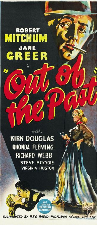
Poster Before 1950

Out of the Past Poster - Click to View Extra Large Image
Out of the Past (1947)

The bright colors and positioning of the words balance this poster very well. The shape of the poster makes the eye move easy in a top to bottom motion.

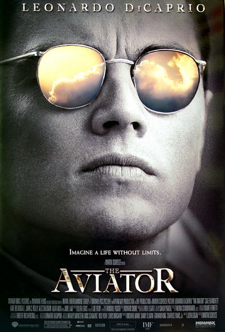
This Millenium Poster

The Aviator Poster
Poster Design by Intralink Film Graphic Design
The image, being a close-up on the face, emphasizes that the movie is primarily based upon this man and his life. The contrast of the the sunglass lens being the only part of the picture that is color, brings forward his vision and what he lived for.


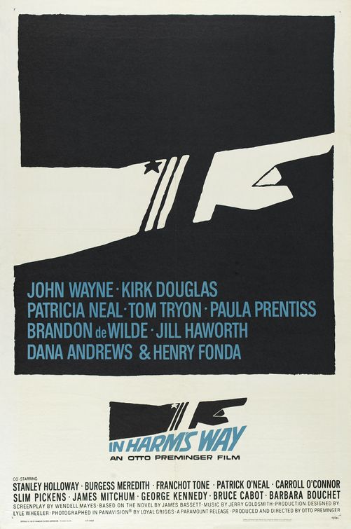
In Harm's Way Poster - Click to View Extra Large Image
Poster artwork by Saul Bass
The image of the pointing arm strongly emphasizes power and order, also revealng the serious tone of the film. There is a strong contrast between the image and the text. The text being blue, pops out from the background making it easy to read.